
-
July 08, 2010
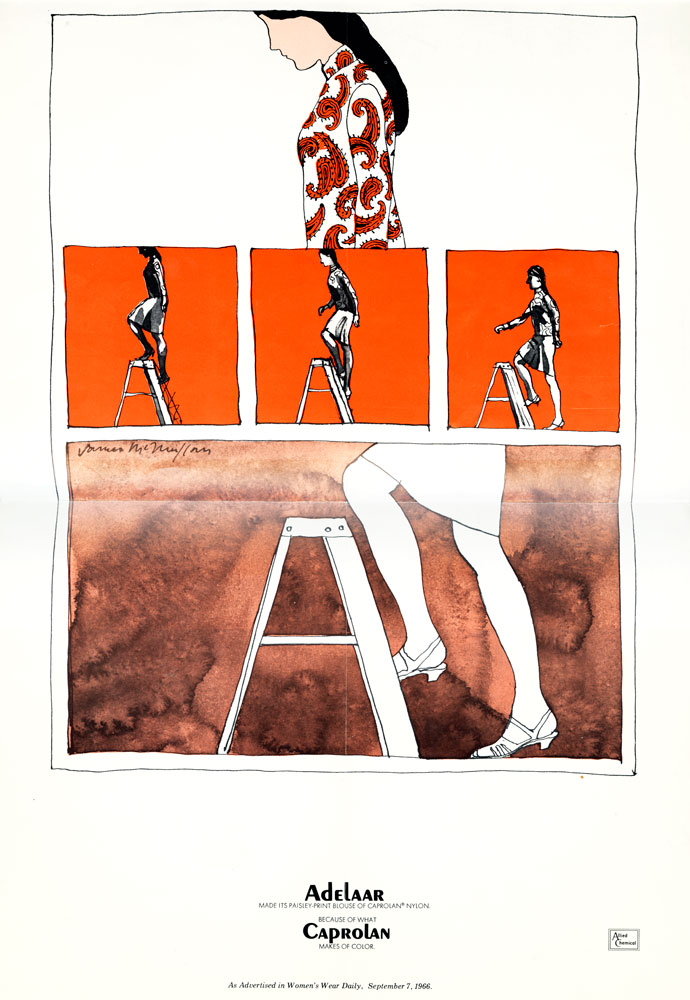
McMullan for Caprolan
James McMullan designed and illustrated this piece for Caprolan nylon during his first year at Push Pin; it appeared in the September 7, 1966 issue of Women’s Wear Daily.
 Continue Reading
-
June 14, 2010
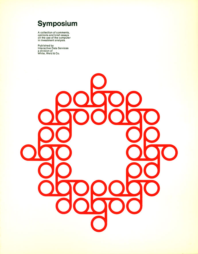
Ring leaders
If Chermayeff & Geismar could be said to have one particular speciality, it would probably be the knack for distilling complex organizational systems into extremely reduced graphic ideas: their calling card in this respect was the Symbol Signs project. But this poster for Interactive Data Corporation, with its monochrome figuration for a symposium, also falls neatly into the category (along with work for Xerox). Click through for the full page.
 Continue Reading
-
June 04, 2010
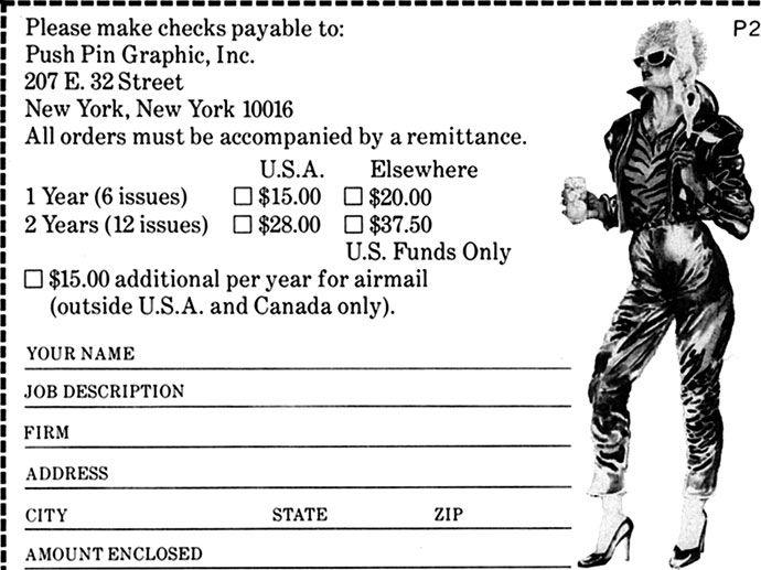
Subscribe to Push Pin Graphic
The thing that fascinates me most about Push Pin Graphic is how unpredictable they manage to be all the time. Even apart from the contents of each issue, every promotion contains — no matter how generic the thing as a whole may be — some off-kilter element that has a defamiliarizing effect on the whole endeavor. The Cherie Currie-esque figure here has no other reference anywhere on the page, she’s just hanging out in the margin of the tearaway.
 Continue Reading
-
May 28, 2010
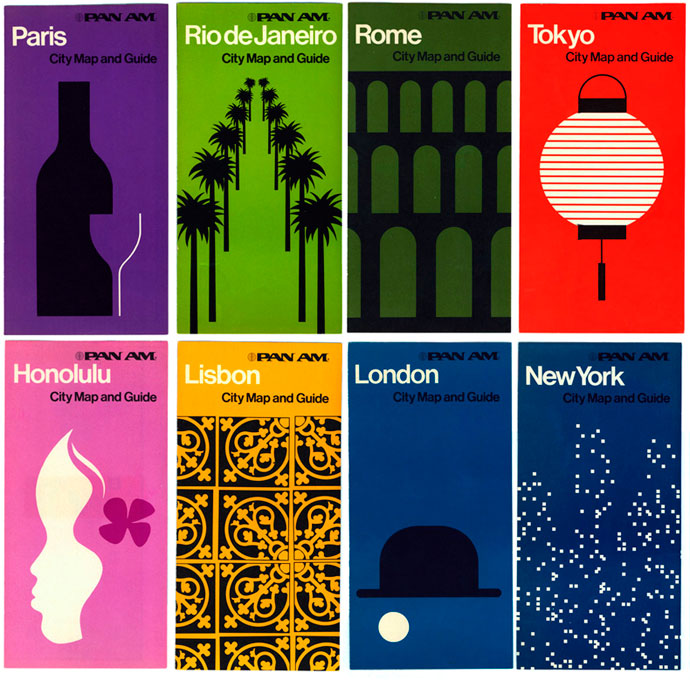
From Rome to Rio
George Tscherny completed a bogglingly wide range of work standardizing the graphics for Pan Am in the early ’70s, redesigning everything from timetables to stewards’ aprons over the course of two years. These city guides are of a piece with the company’s other projects of that era, recalling both the bold imagery of Chermayeff & Geismar’s posters for the company and Tscherny’s own modular environmental graphics.
 Continue Reading
-
May 18, 2010
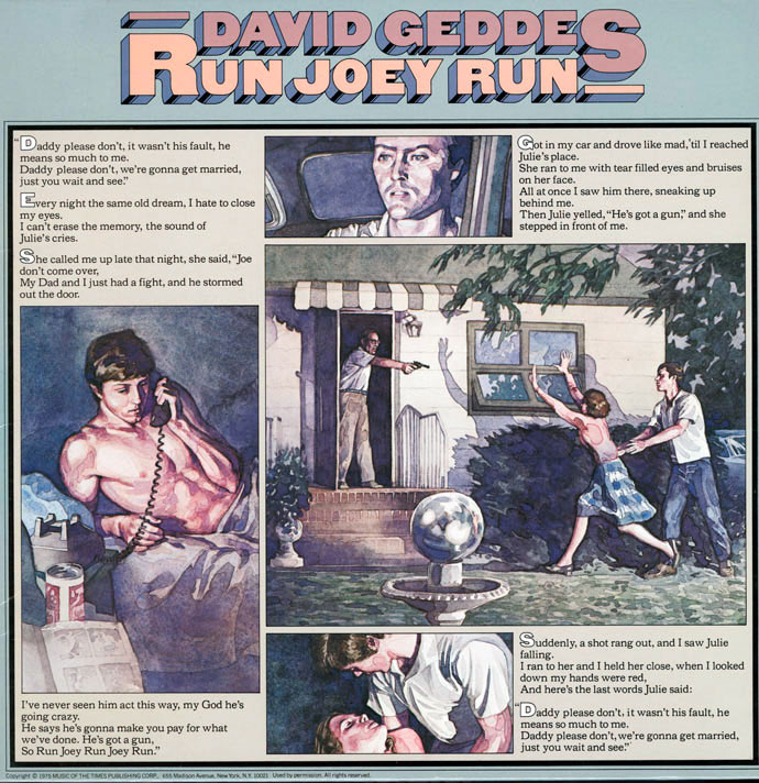
Run Joey Run
Needless to say, that wedding never took place, not after Julie accidentally took a bullet intended for Joey from Daddy’s gun. Classing up the joint considerably are James McMullan’s expressive illustrations for the album’s cover, which covey a sense of desperation and actual emotional stakes.
 Continue Reading
-
May 02, 2010
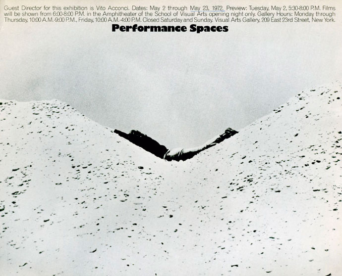
Performance Spaces
This striking invitation features an image from David Oppenheim’s “Parallel Stress,” in which a figure cups the interior curve of two mounds of earth (in the other, I believe, he hangs in space). The washed-out monochrome palette makes it all blend together, giving the sense of the artist as an organic component of the environment: which aptly reflects this exhibition’s emphasis on the intersection between installation and performance art. Featured in Performance Spaces: a series of printed scores (“songs written for specific birds and athletes”) and the documentation for “Silent Ping Pong” by Bill Beckley, a performance installation by Terry Fox, a confrontational sculpture by Howard Fried, and Dennis Oppenheim’s “Gingerbread Man.”
 Continue Reading
-
March 09, 2010
Sal Jon Bue
Bue also designed this piece for the 1964 World’s Fair and his work was featured in Early/Later, an exhibition at the Whitney in Stamford in 1991.
 Continue Reading
-
February 09, 2010
Missed connections
You were the cute bearded guy on the F train this morning. I was the somewhat pallid but classically beautiful girl. I thought we were a good match but it was as though we were pulled apart by powerful ropes. Want to have coffee sometime?
 Continue Reading
-
October 02, 2009
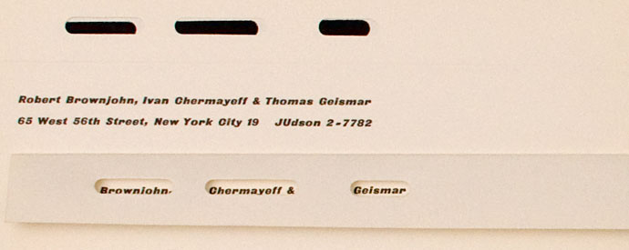
Chermayeff and Geismar’s letterhead on Silver Lining
One of our favorite design ephemera blogs, Silver Lining, recently asked us to participate in their Top 5 feature, where they invite fellow bloggers pick out five things for them to showcase as a series. Beth and I dug through boxes MG1 1A-4B and chose our favorite stationery and envelopes by letterhead wizards Chermayeff & Geismar.
 Continue Reading
-
September 24, 2009
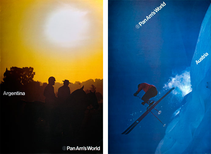
Chermayeff & Geismar for Pan Am
We have written on Tscherny’s artwork and modular displays for Pan Am. And now we’ve also uploaded more of C&G’s posters in the series (in our Flickr).
 Continue Reading
-
September 18, 2009
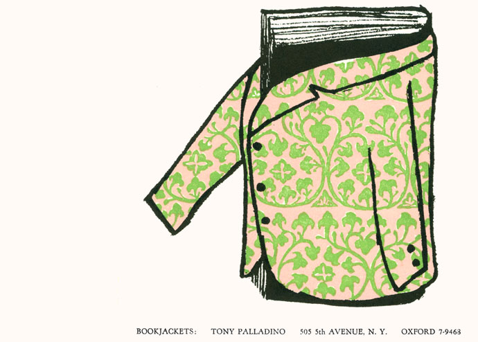
Another pitch from Palladino
About a decade before Tony devised his ‘guerilla marketing’ self-promotion campaign, the designer took a similarly witty but somewhat more traditional approach. Four versions of this card were printed, each in three colors on heavy stock, and sent to publishers without any additional pitch. Set simply with his address and isolating a single area of specialization, they relied on a single strong image to convey their point.
 Continue Reading
-
August 14, 2009
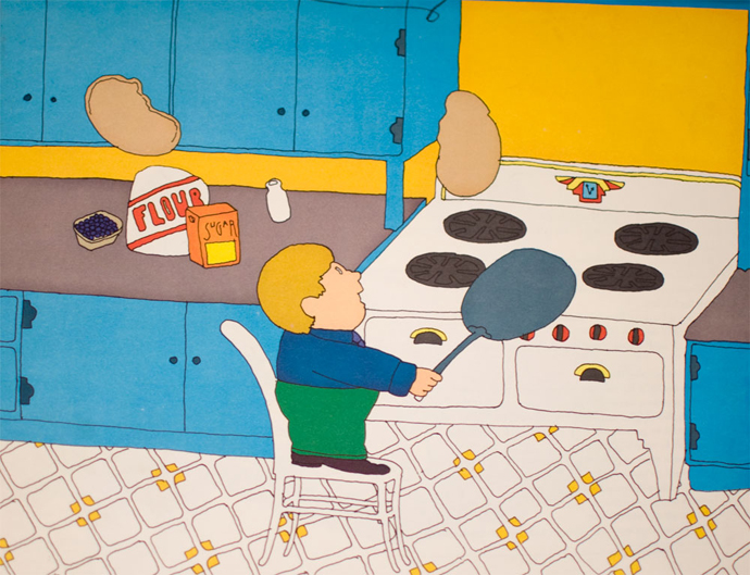
The Pancake King
In 1971, Phyllis La Farge and Seymour Chwast collaborated on the children’s book The Pancake King, which described the rapid ascent of a young master of the griddle pan. It spoke of the joy of breakfast, the perils of fame, the importance of family and of maple syrup. More spreads from The Pancake King are viewable on Flickr (thanks to Norman Hathaway), and show Chwast’s dexterous use of scale and bleed between spreads, and tidily-set Bodoni. The book was included in AIGA’s Fifty Books of the Year.
 Continue Reading
-
August 07, 2009
Twen at the Visual Arts Gallery
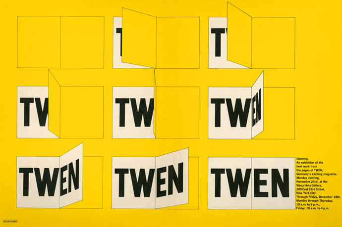
Milton Glaser designed this poster for an exhibition at the Visual Arts Gallery in late 1965, organized by then Visual Arts Gallery director Shirley Glaser. Twen, a West German magazine for “people in their twenties: from 15 to 30,” was wildly influential in design circles worldwide—with a grid system composed of twelve small modules combined in an internally regular but widely varying page layouts, and liberal full-bleed spreads photographed by Art Kane, Will McBride, Irving Penn, Richard Avedon and others (and illustrations by Heinz Edelmann). It introduced many design students to Willy Fleckhaus, the magazine’s art director and sometime editor, who became famous for his virtuosic combination of close-set typography and tightly-cropped images. The rigid geometry of this poster, though not usually associated with Glaser, was a mode he employed often for SVA exhibition posters (more can be seen here and here). Though the graphic austerity is a contrast to his earlier work, the underlying expression of concepts through tactile visual representation is, I think, unmistakable Glaser.
 Continue Reading
-
July 28, 2009
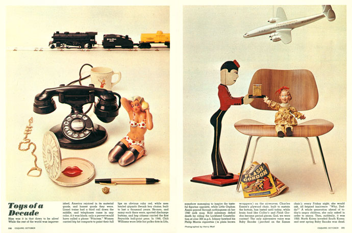
Toys of the 1940s
(Esquire casually omits Ray Eames’ credit on the DCM.)
 Continue Reading
-
July 10, 2009
Seymour Chwast for McDonald’s
In 1979, McDonald’s hired Seymour Chwast to contribute one version of the packaging for the introduction of their new product, the Happy Meal. The promotion cost one dollar, and comprised a hamburger or cheeseburger, twelve-ounce soft drink, a small order of french fries, and a McDonaldland Cookie Sampler (not pictured). Along with their comestibles, the first customers could look forward to discovering either a McDoodler stencil, puzzle book, a McWrist wallet, an ID bracelet or McDonaldland character erasers.
 Continue Reading
-
June 26, 2009
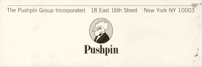
The Push Pin corporate identity
This label, stuck authoritatively on the back of a mounted board as a bit of corporate identity — complete with the overrule, grotesk “Group Incorporated,” and high-contrast logotype — exploits its context to achieve a kind of reflexive wit, a kind of acknowledgment of what is being put over, that gives it a unifying effect (it is at once more than, and no more than, a “bit of corporate identity”). This is achieved with an unusually unaffected air — a combination that I think has always characterized Chwast’s work.
 Continue Reading
-
June 22, 2009
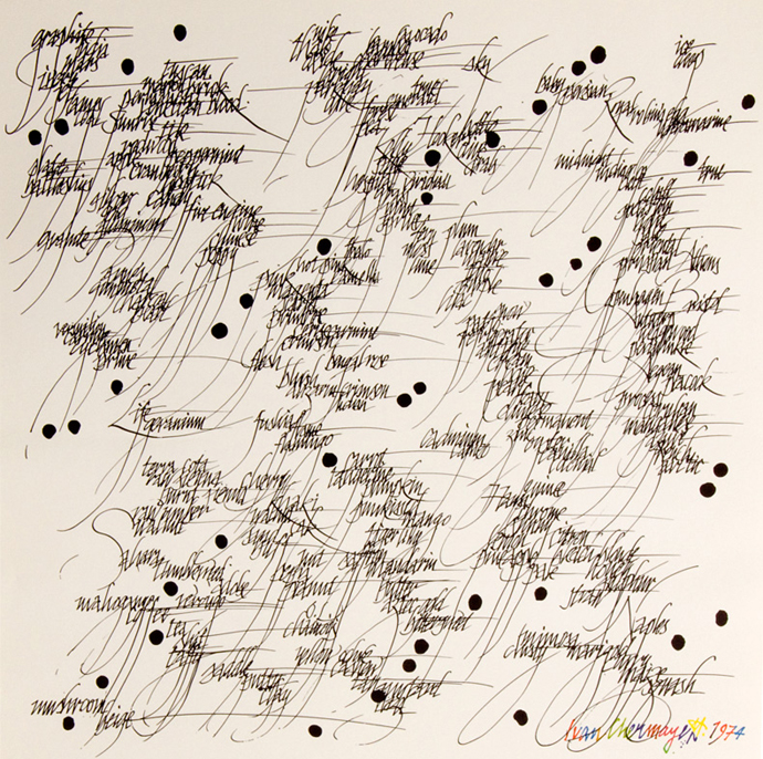
Script pattern by Ivan Chermayeff
Ivan Chermayeff designed this poster for AIGA’s “Color” exhibition in 1974, which collected work by artists, photographers and designers. Tightly flowing script creates a pattern made out of textual gibberish, where exaggerated descenders are punctuated at intervals with large blobs of ink. Click through for the whole image, with Chermayeff’s colorful signature.
 Continue Reading
-
June 11, 2009
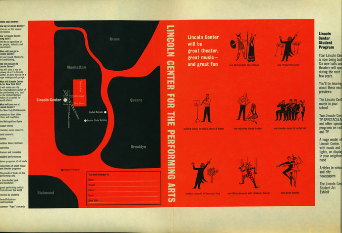
Lincoln Center book cover
Lincoln Center’s groundbreaking ceremony took place in on May 14, 1959, so this book cover designed by Chermayeff & Geismar must have been created some time in the early 1960s. According to the text, Lincoln Center would make New York City “… the international capital of the performing arts, just as the United Nations makes it a capital for world affairs.”
 Continue Reading
-
June 01, 2009
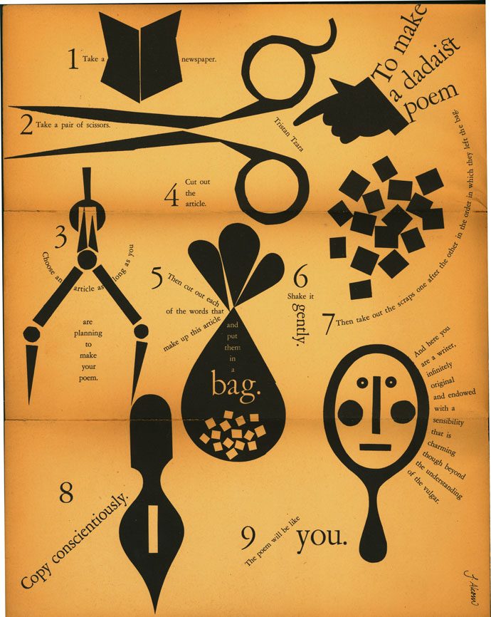
Dada, explained
Here’s an ironic instructional piece from early Push Pin Studios member John Alcorn. A highly accomplished designer and illustrator, Alcorn also designed the opening titles for several Fellini films. Click here for the full image.
 Continue Reading
-
May 26, 2009
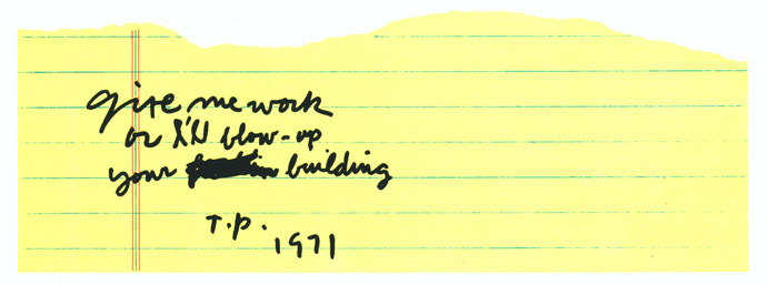
Guerrilla marketing
Palladino made a point of choosing business associates who would get the joke, and would recognize his initials, T.P. He also says he wouldn’t dare pull a stunt like this today.
 Continue Reading
By Collection
-
School of Visual Arts Archive
-
SVA Historical Event Recordings
-
Gail Anderson Collection
-
SVA COVID Collection
-
Ed Benguiat Collection
-
SVA Publications and Institutional Records
-
Ivan Chermayeff Collection
-
Ralph Caplan Collection
-
Chermayeff & Geismar Collection
-
Seymour Chwast Collection
-
Stephen Doyle Collection
-
Heinz Edelmann Collection
-
Richard Wilde Papers
-
Roger Ferriter Collection
-
Louise Fili Collection
-
Cris Gianakos Collection
-
Bob Gill Collection
-
Milton Glaser Collection
-
Keith Godard Collection
-
Steven Heller Collection
-
David Mazzucchelli Collection
-
Ed McCabe Collection
-
James McMullan Collection
-
Tony Palladino Collection
-
Stefan Sagmeister Collection
-
Paul Sahre Collection
-
Deborah Sussman Collection
-
Fred Troller Collection
-
George Tscherny Collection
-
Henry Wolf Collection